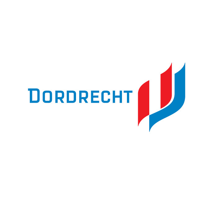
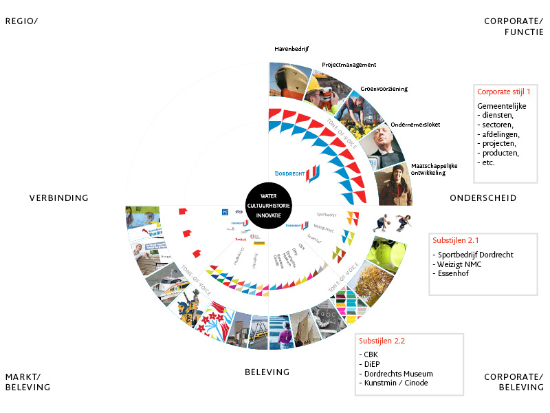
Visual identity for the municipality of Dordrecht
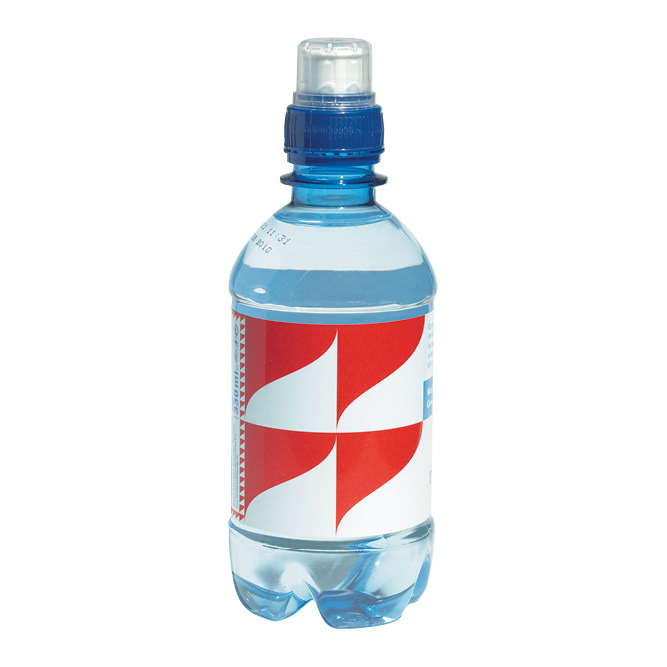
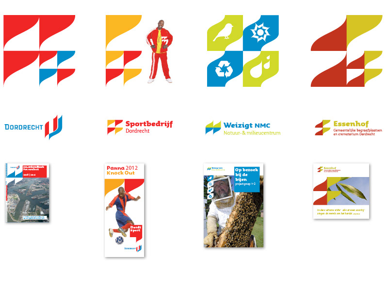
One graphical element, that resembles the contour of the island the city is situated on, combined with a simple set of rules creates a distinct language. Endless combinations of the element result in a dynamic visual language with a strong character that is immediately identified as the City motif. The new heraldic language unites several sub-identities with the municipal identity and allows parties to create specific communication with their audiences. A custom made model created insight in the way to manage the new visual identity.
A uniting style that is simple and fun to work with, were the demands in the designbrief. This work is created at Barlock.
Corporate identity | Sub-styles | Logo re-style | Style definition | Implementation
A uniting style that is simple and fun to work with, were the demands in the designbrief. This work is created at Barlock.
Corporate identity | Sub-styles | Logo re-style | Style definition | Implementation
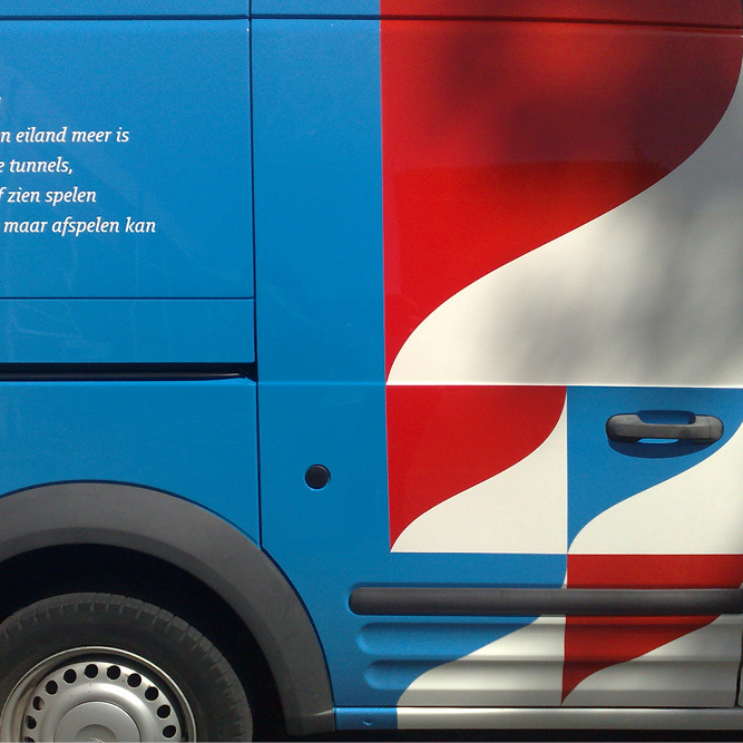


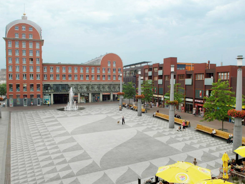
Artist impression of the City motif implemented on a square in Dordrecht